Bolt Merchant Experience Refactor
Introduction
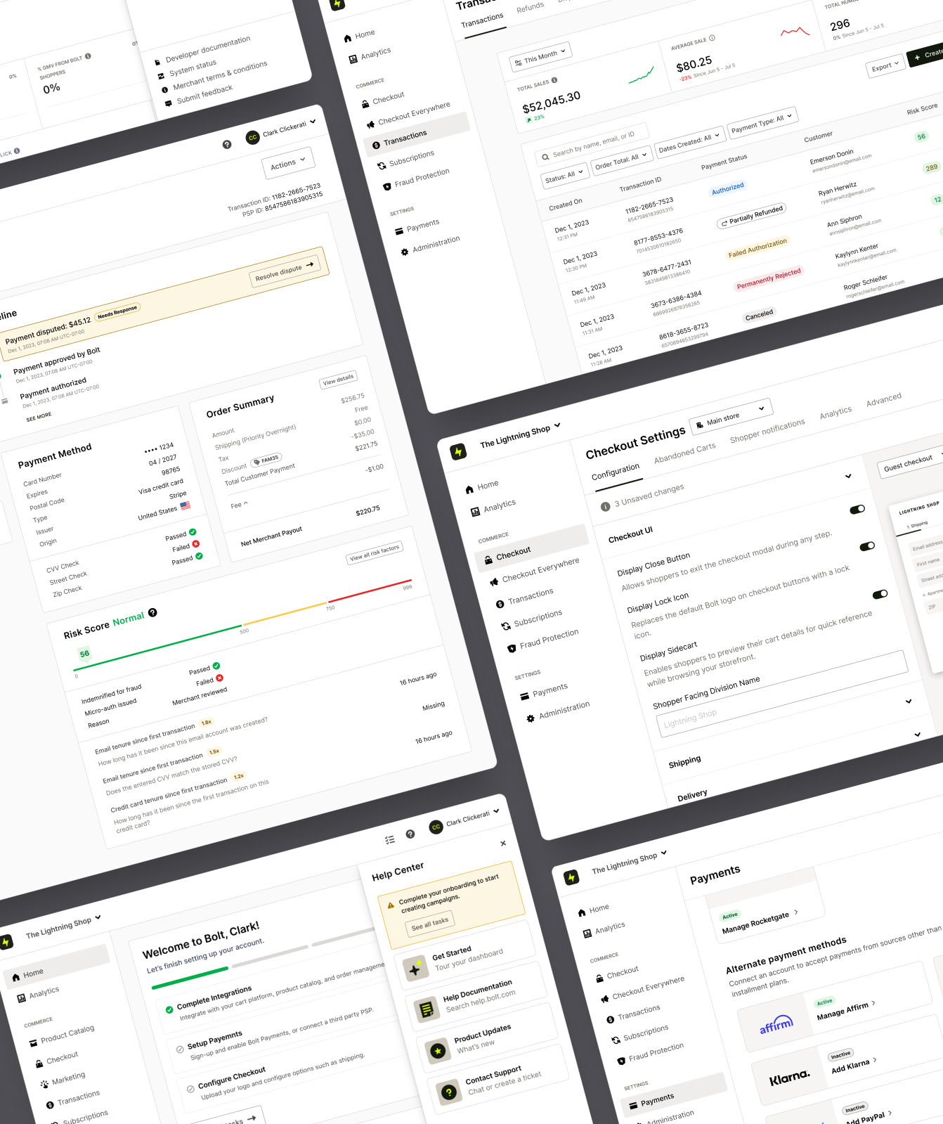
Shortly after I joined Bolt in late 2021, I led an initiative to refactor the surface used for all of our merchant facing experiences — the merchant dashboard.
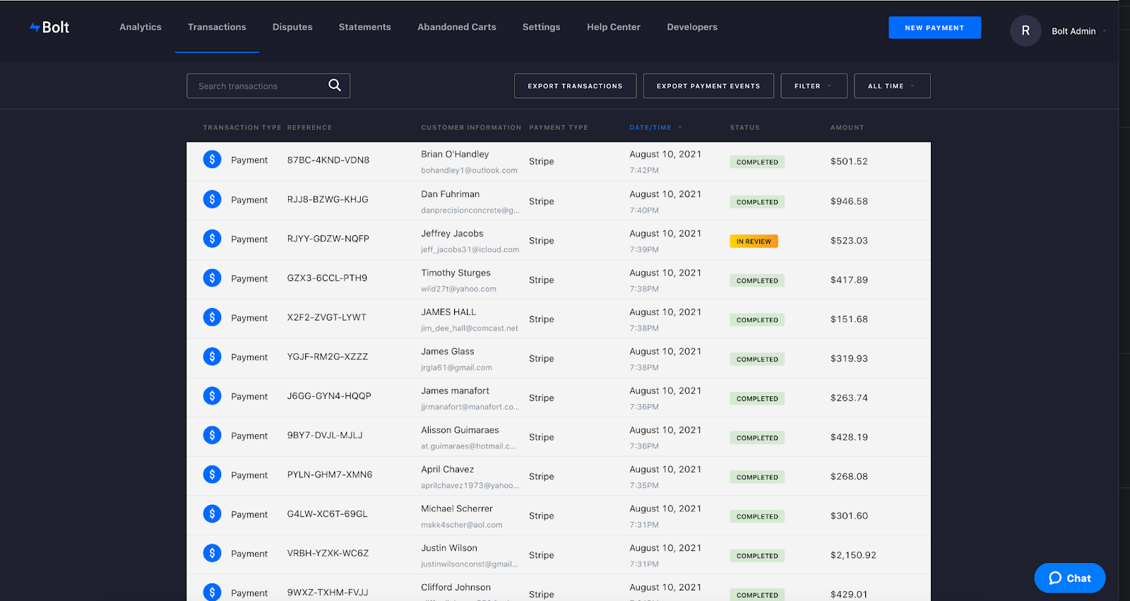
I inherited a product that had never benefited from much design consideration, it mostly consisted of disparate screens put together by engineers who were more focused on shipping features, rather than considering a holistic merchant experience.
The Problem
The merchant dashboard reached a point where it could not scale to accommodate new products and capabilities. At that juncture we were also preparing to scale from a few hundred merchants to tens of thousands — the dashboard wasn't equipped to serve that many users with diverse needs.
Who are the Users?
The merchant dashboard serves as a back office tool for eCommerce merchants who use Bolt products such as accelerated checkout.
However these users are not a monolith, there are personas that are primarily concerned with onboarding, integration and success monitoring of their Bolt implementations. Other roles within the merchant org use the dashboard to deal with day to day operational tasks such as refunds and disputes.
Project Goals
I kicked the project off by identifying two fundamental goals that could act as a north star in what I knew would be a long process, involving multiple teams and stakeholders.
Improve Usability Today
We needed to deal with the UX debt accumulated in the merchant dashboard, and improve navigation and usability for our customers. The goal was to give merchants a consistent experience, and allow them to quickly understand new areas of the dashboard through familiar patterns.
Prepare to Scale Tomorrow
I wanted us to coalesce around a scalable strategy for our merchant platform, establishing a foundation for future products and capabilities. My hope was that the new dashboard will allow us to ship products quickly, while maintaining a consistently high standard.
Card Sorting
One of the primary complaints from users was the difficulty of finding things. While internal stakeholders inversely struggled with figuring out where to place new capabilities.
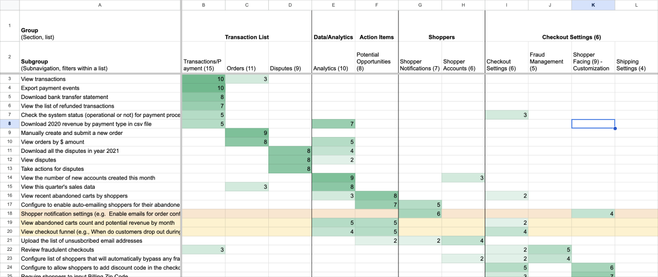
Given this, our first order of business was to run a card sorting study with merchants. This would help us shape a mental model of how various capabilities should be grouped and eventually help shape the future IA.
This study was led by our amazing UX researcher, Horyun Song. I was involved in shaping the card names, determining demographics, and I sat in on some of the guided sessions.
Methodology
Open card sorting with 41 cards — participants came up with their own categories and no predefined categories were given.
Cards were phrased as an action instead of the current category name. (e.g., “Manage who has access to this tool” instead of “Users”)
Participants
15 Total
(7 SMB Owners & 8 eCommerce Managers)
GMV:
<3M (7), 3M - 10M (4), 10M+ (4)
Criteria:
Uses an eCommerce dashboard daily
Platforms used:
Shopify, Magento, Salesforce, WooCommerce, BigCommerce, Weebly, Wix
Information Architecture
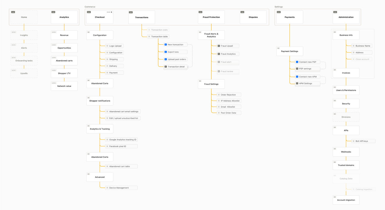
The card sorting study helped us define the new IA. There were some patterns in the data that informed groupings that made intuitive sense. Where there were gaps and inconsistencies we used our best judgement or leaned on convention.
One thing that we tried to keep in mind is how this structure would eventually scale as we added new products and features to the dashboard in the future.
Navigation Design
Based on the IA we developed, I set out to design a navigation pattern that would fit our needs today, and hopefully accommodate changes in the future. The last part being especially important as I knew Bolt’s product strategy was rapidly evolving.
Primary Navigation
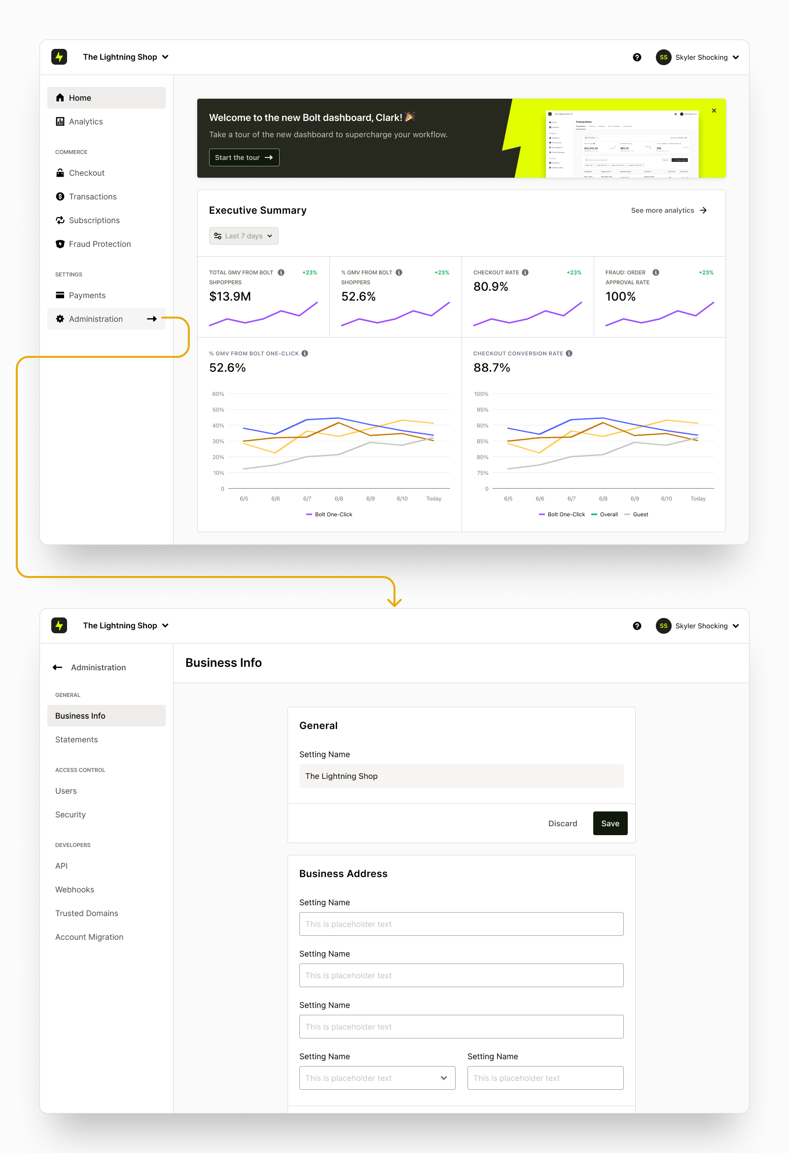
The first big decision was to ditch the website style horizontal nav bar and go with a classic left-hand navigation menu typical for web based apps. This decision was driven by the ability to show more of the IA by taking advantage of vertical (and scrolling) space — promoting easier discovery, and faster access compared to forcing users to dig through multiple drop-down menus in the old menu.
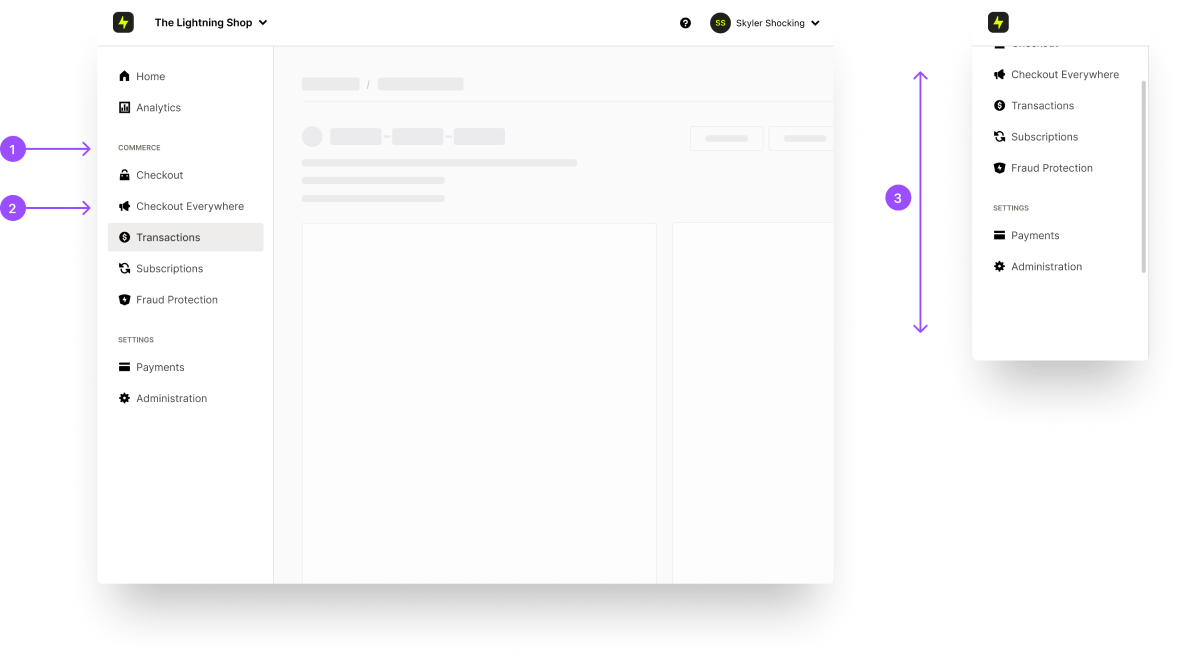
1. Section heading
2. Navigation tab
3. Vertical scroll when content overflows
L2 Navigation
For particularly deep parts of the IA, we needed additional levels of navigational structure. The administration section for example leveraged a drill-down pattern that revealed a sub nav menu when accessed.
Horizontal Tabs
Additionally, we established a standardized horizontal tab pattern for subsections within a L1 page.

Evolution
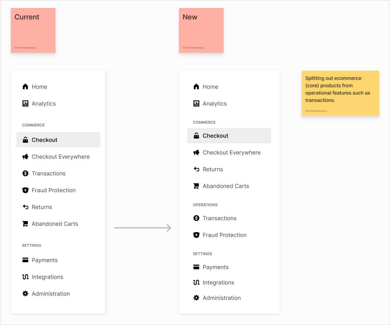
Almost two years later, our product portfolio had evolved. This had not come as surprise, since flexibility was one of the main considerations for the original design. We were able to accommodate the necessarily changes to IA with very minimal impact to engineering and to users’ familiarity with the dashboard.
Usability Study
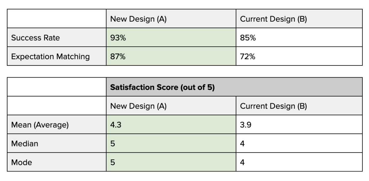
We ran a series of unmoderated usability tests comparing our current dashboard UI to a prototype of the new design.We ran a series of unmoderated usability tests comparing our current dashboard UI to a prototype of the new design.
Methodology
We asked participants to perform a selection of 7 tasks that represented common tasks across the dashboard, including tasks we suspected to be problem areas that we intend to fix with this redesign.
We tested for success rate and expectation matching.
Participants
15 Total
GMV:
<3M (7), 3M - 10M (4), 10M+ (4)
Criteria:
Uses an eCommerce dashboard daily
Platforms used:
Shopify, Magento, Salesforce, WooCommerce, BigCommerce, Weebly, Wix
Results Summary
In most cases, users found the new design easier to navigate with things placed more or less where they expected them to be. Some tasks performed similarly. We also found some usability issues in the new design that we have since addressed in a new iteration of the prototype.
Templates & Guides
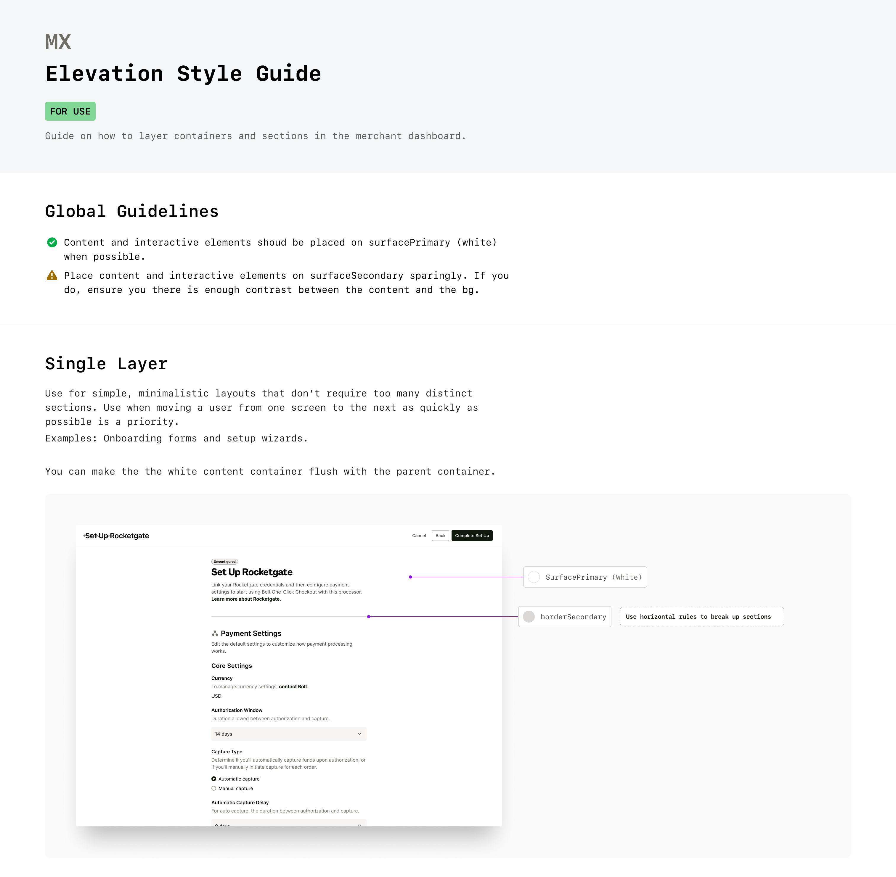
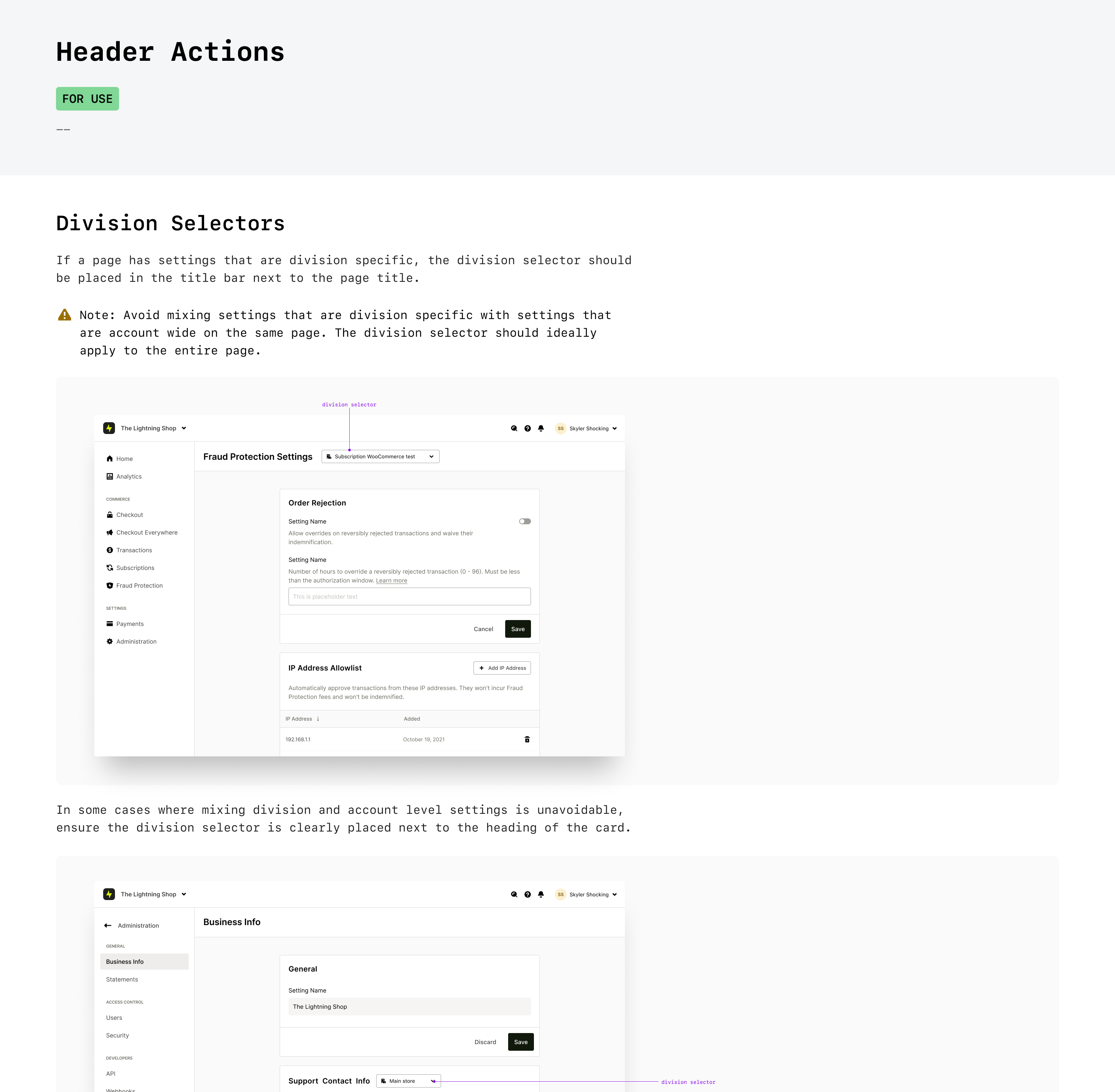
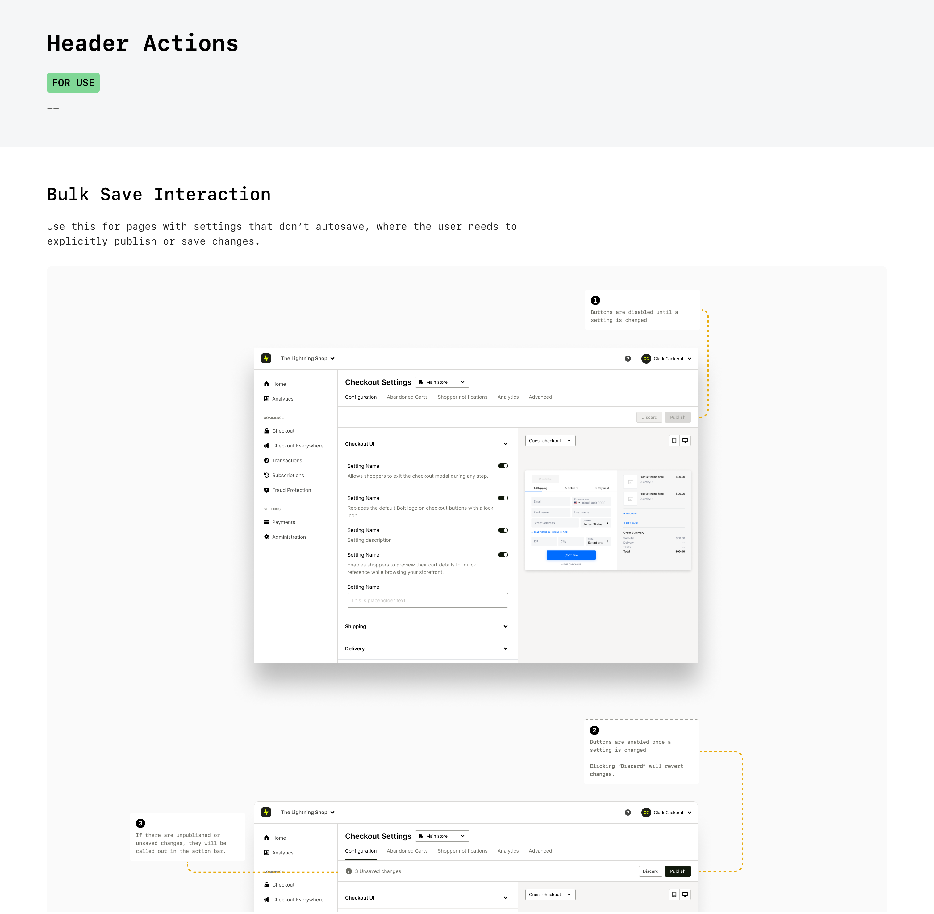
In order to promote faster decision making and consistent patterns that users could learn and rely on, we invested some time in developing guidelines for common use cases throughout the merchant experience.
Beta Phase
The new merchant dashboard was a significant launch for Bolt. This came with a few key challenges:
1. Such a huge undertaking leaves a lot of room for error. Inevitably, brand new products launch with technical bugs and overlooked usability edge cases — despite everyone's best intentions.
2. A redesign can sometimes be polarizing, and some users are not keen on relearning new tools.
Grace Period + Feedback Loop
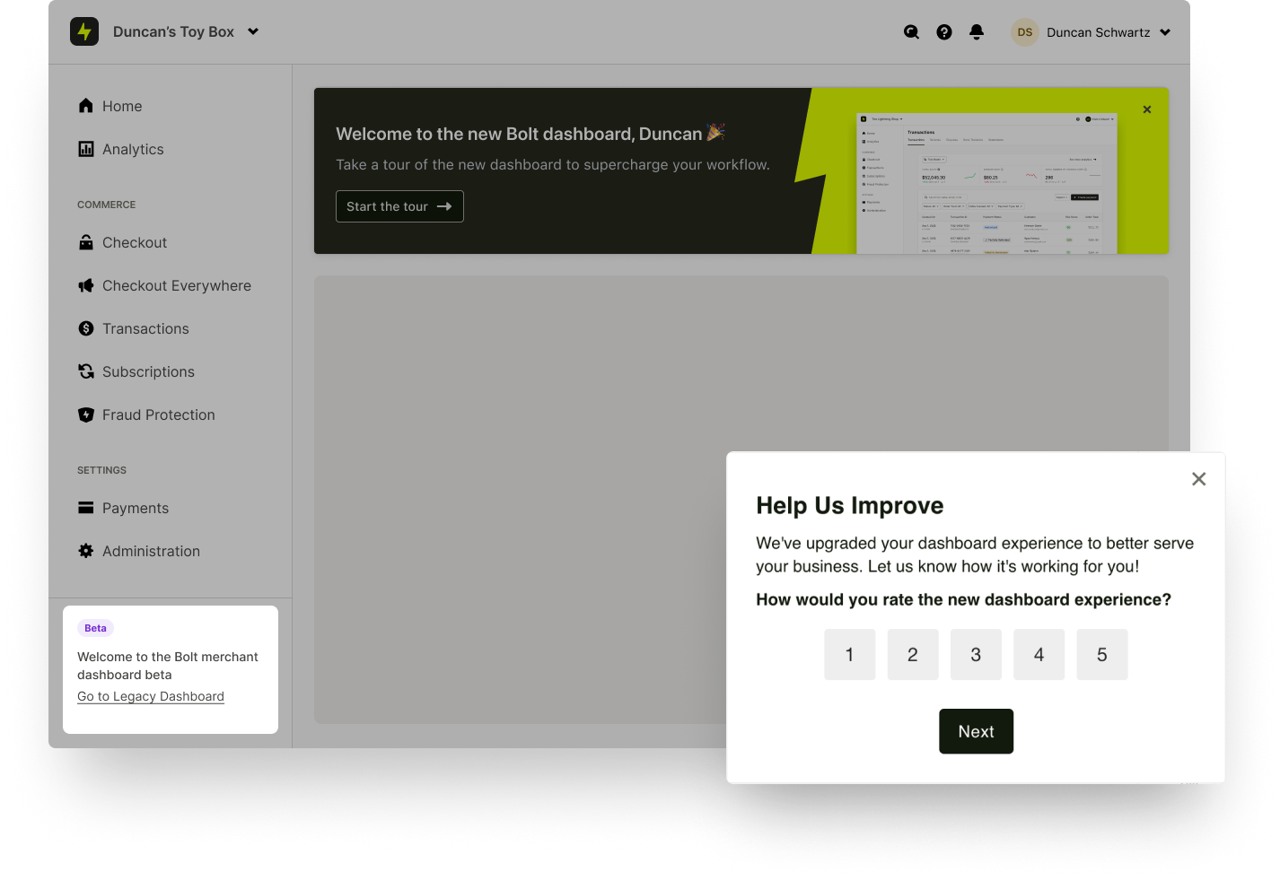
We opted to give our customers, and ourselves a grace period. We launched the new dashboard as a beta, and gave merchants the option to swap between the old and new versions freely. We kept the beta program open for approximately 3 months.
Over this time period we gathered a lot of valuable feedback from merchants via an in-app feedback form. We identified a few gaps that we were able to address in a series of follow-on updates leading up to the GA release. We phased out the old dashboard once we reached reasonable comfort level.
Key New Frameworks
After our GA launch, we quickly capitalized on the modularity and scalability of the new dashboard and developed several new frameworks that would improve merchants quality of life, and more importantly, get them using our products quicker.
Onboarding Acceleration
Historically, new merchants were required to fill in a complex, unwieldily form that then had to be manually re-input by an IM into our internal admin tool in order to provision a new merchant account.
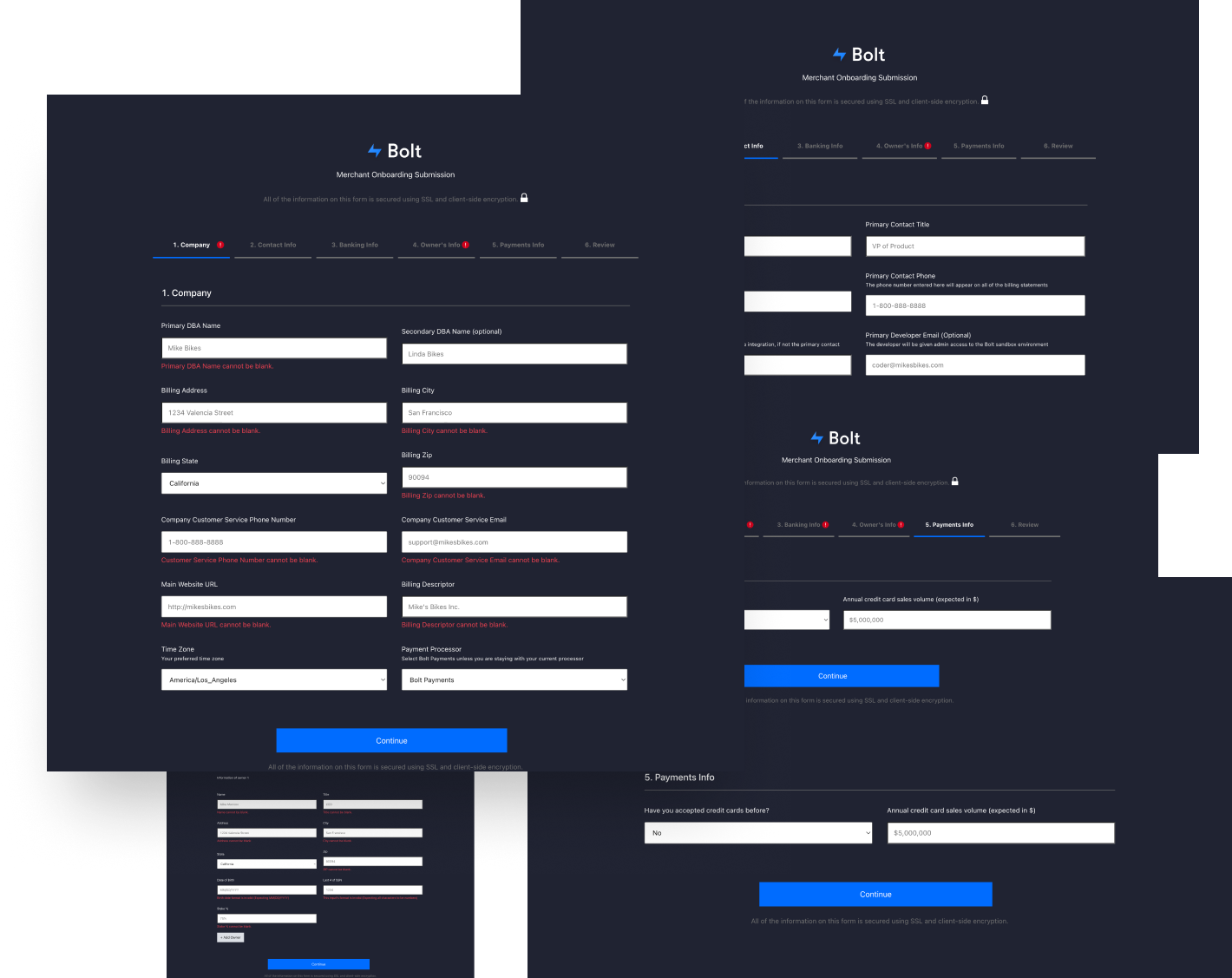
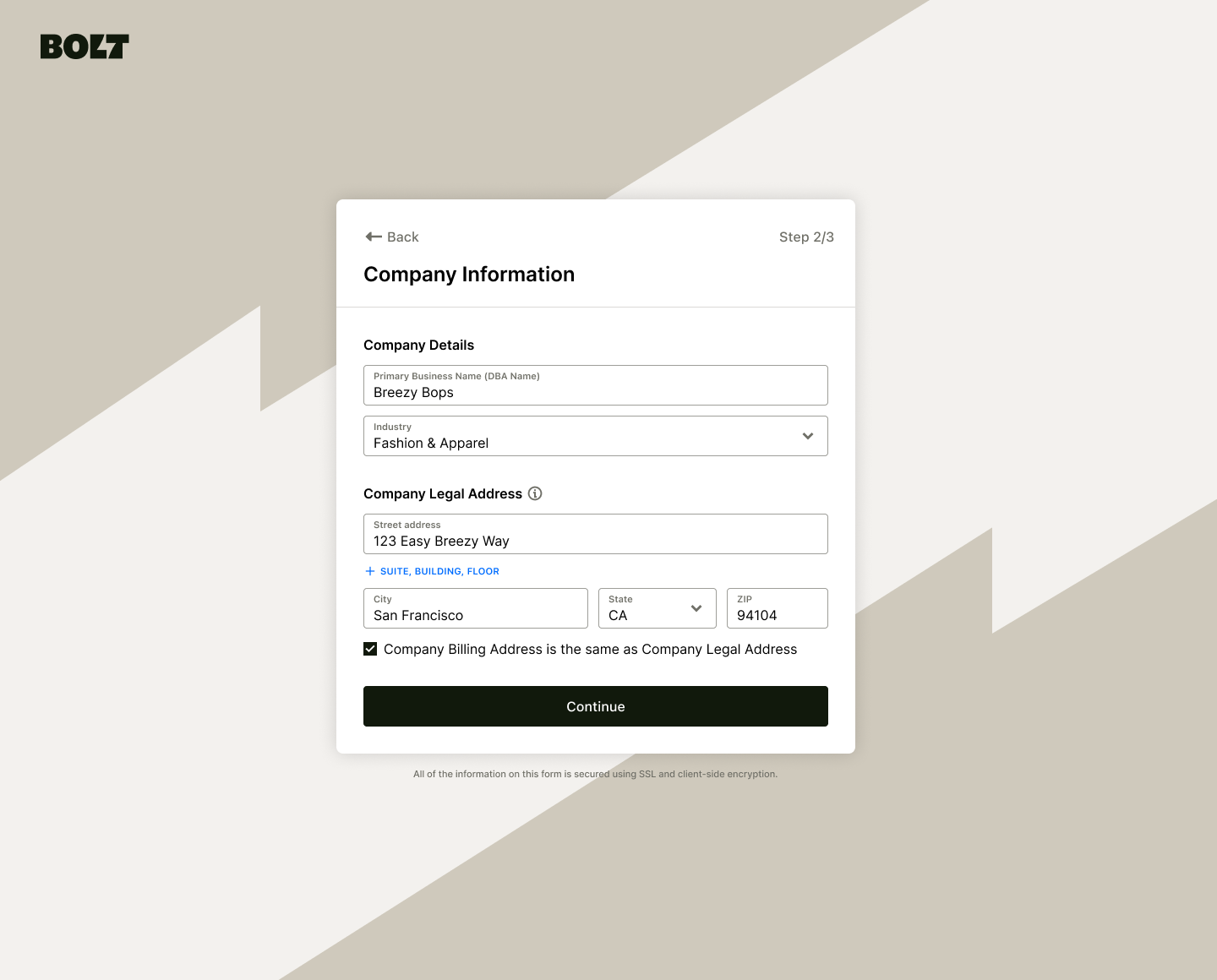
With this upgrade, merchants are able to self-create an account in just a few easy steps and have access to the merchant dashboard in minutes instead of weeks.
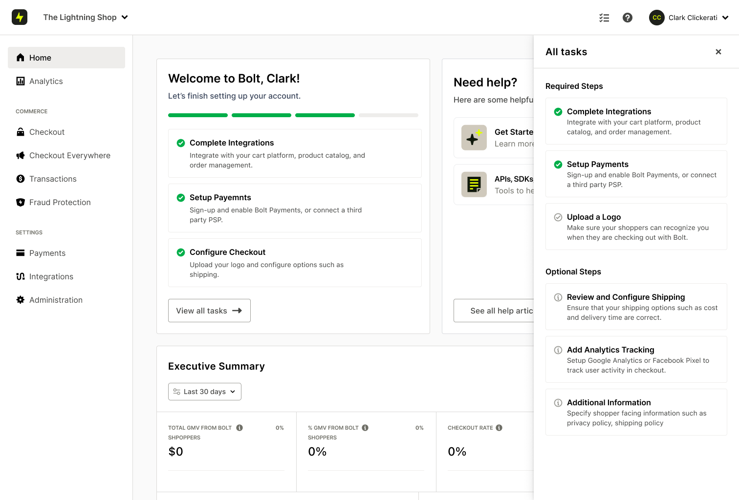
After gaining access to the merchant dashboard, we guide them to additional steps such as setting up payments.
Additionally, we identified several tasks that were not critical to complete before provisioning a merchant account. Instead we deferred them to after the account was created so that they can be done asynchronously in the new merchant dashboard.
This freed merchants to complete onboarding tasks when it was convenient for them, but more importantly, allowed those tasks to be done by the right person.
To note: The persona creating the account was not always the same one that was doing other onboarding tasks (such as payments setup, and cart platform integrations)
Integrations
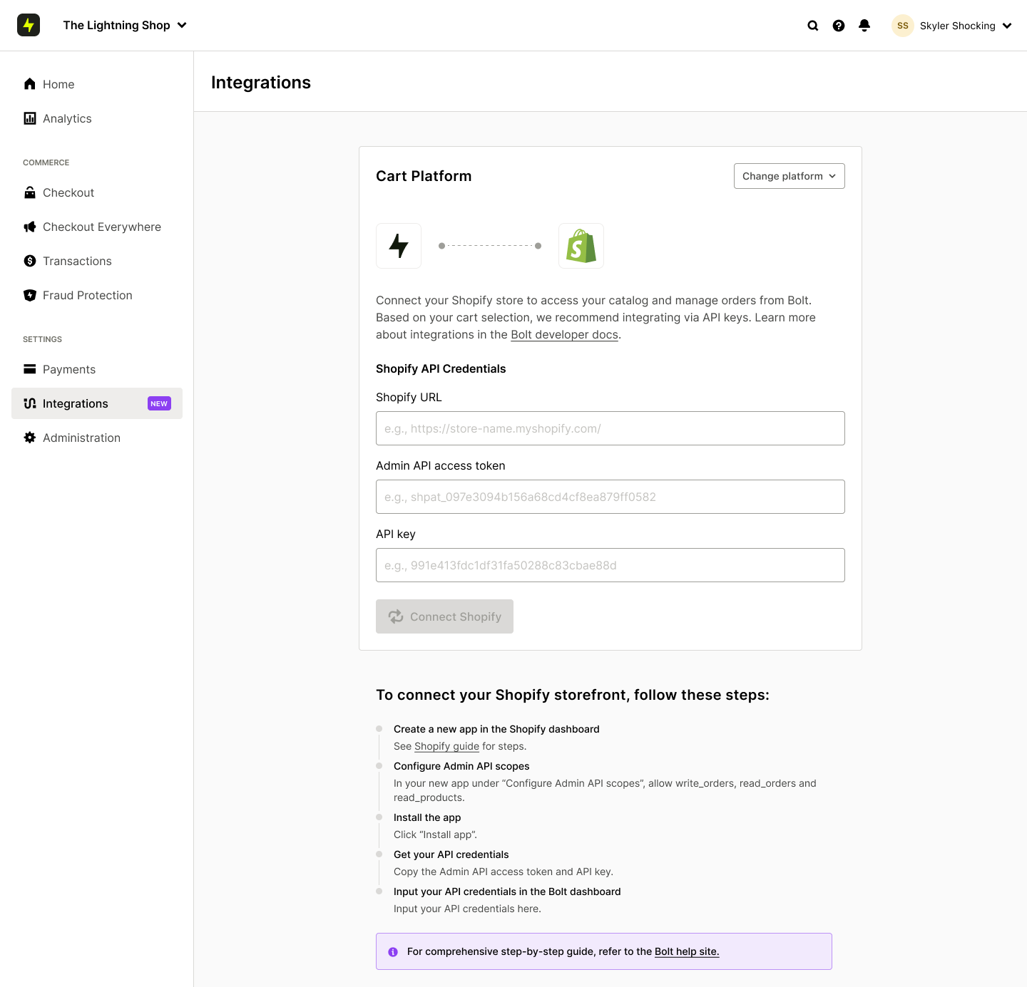
Further, we build an integrations framework that allowed merchants to connect other tools from their eCommerce ecosystem much quicker than before when they needed to dig through help docs and rely on customer support.
Cross-Sell Framework
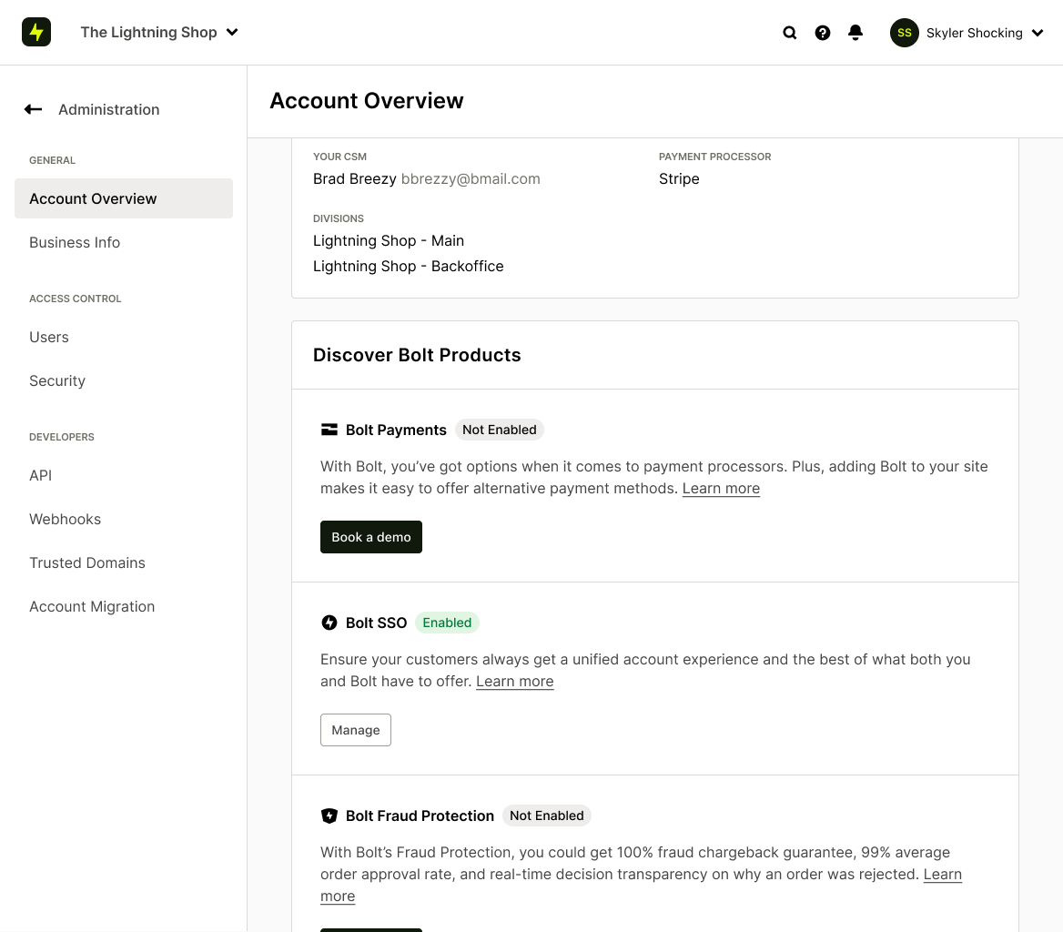
Going back to one of the two north star goals for this initiative, we wanted the merchant dashboard to enable us to expand to new products.
One framework that we introduced was a way for us to cross-sell additional Bolt products directly in the dashboard.
Concusion
This initiative was a huge undertaking, involving many people across engineering, product, and design. Ultimately the effort was worth while.
Some of the key results we achieved where:
- Enable teams to build an launch valuable products faster. The new merchant dashboard unlocked at least 5 new products that would otherwise be very difficult to get off the ground
- We reduced the average time for merchants to onboard from weeks to days while getting them into the product in a matter of minutes.
